Word Paint | A Comprehensive Guide to Typography
"Typography is the art of arranging type to make text legible, readable, and appealing." (Wow, right?)
Introduction to the World of Words
Typography isn't just about making words look pretty. It's about making them sing. Think about your favorite posters, magazines, or websites. What makes them pop? Chances are, good typography. This guide dives deep into the beautiful world of how words dance on a page.
What is Typography, Really?
Typography, at its heart, is the craft of arranging letters and symbols for a specific effect. We make a message jump out at you with special styles, sizes, and spaces.
- It's about legibility (can you read it?)
- It's about readability (does it flow well, are you happy to read it?)
- It's about aesthetics (wow! this makes me stop!)
Why Care About Typography?

Source: ytimg.com
Great typography makes reading a pleasure. Bad typography, however, can ruin a whole article or advert (trust me).
- Improves readability
- Creates a specific mood or feeling
- Enhances branding
Fonts: The Building Blocks of Typography
A font is a specific design for a character or letter set. They're like clothes for the words! You don't wear the same style everyday right? So do fonts, they bring life to text! Different fonts, give different moods (modern font- new mood!)
Different Font Families
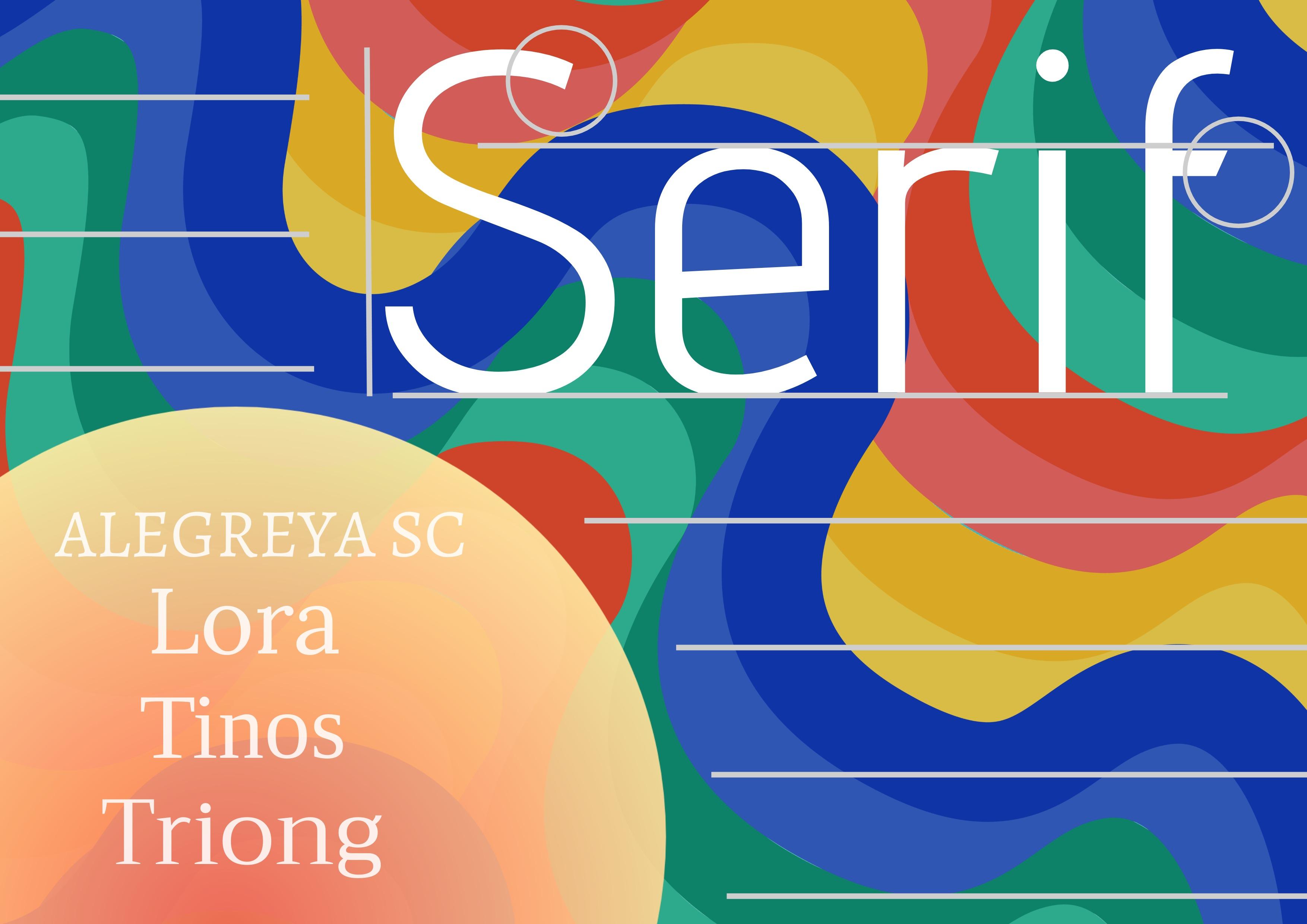
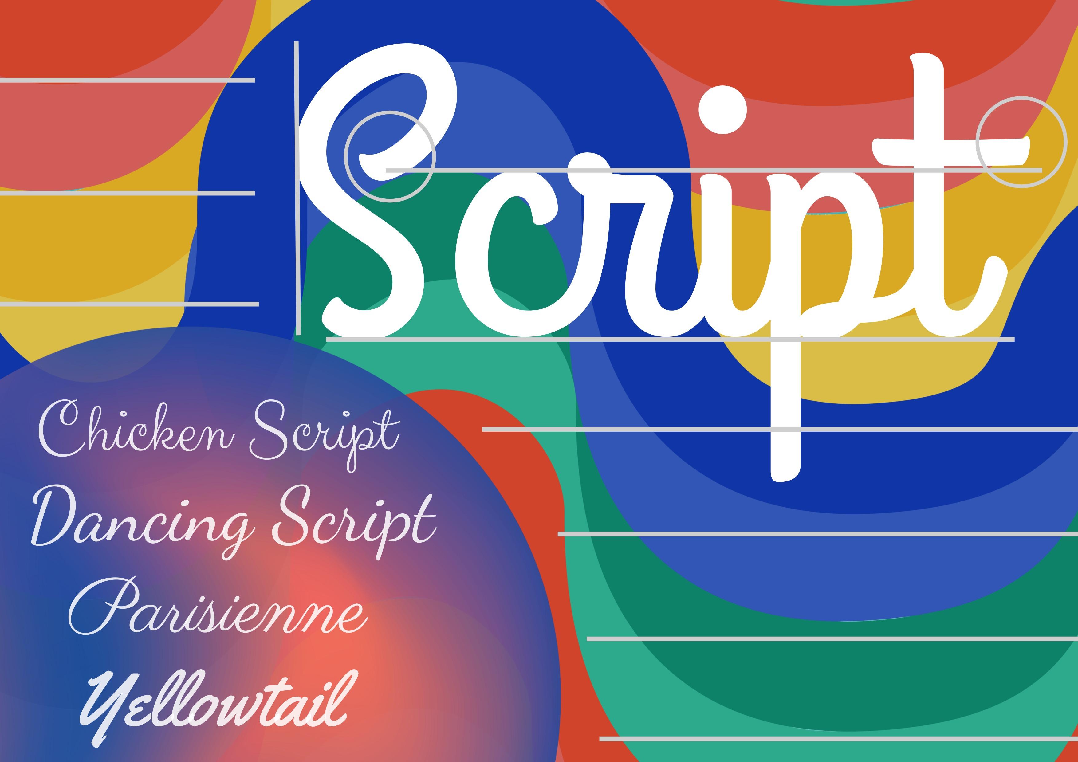
Fonts come in a huge variety. There are some really familiar ones, like the classic serif or sans-serif families. (There are also some others too). This can have various meanings!
- Serif fonts (little decorative accents on the letters, often look classic or formal). Think classic book titles or newspaper headers.
- Sans-serif fonts (no extra decorative accents, feel more modern or neutral). Used a lot in websites or in tech, something sleek (like your mobile phone apps).
Font Weights
These refer to how heavy the font style is:
- Light (very gentle style)
- Regular (default version!)
- Medium (a happy medium, right?)
- Bold (strong impression)
Font Sizes
Just like clothing, different sizes have different meanings or can highlight your words better:
- Huge fonts, you see those first
- Smaller text? Subtlety (or important if given that right space)
Font Styles
Some fonts are italic, others oblique—that lean at a little slant! Think about how italicized words seem extra special! A simple example! These subtle things are important and have effects on reading, some subtle!

Source: designwizard.com
Layouts and Structure (where things come together!)
A well-thought layout (imagine a cool floor plan!) organizes your content to improve the reading experience. There is balance in order. We humans look for patterns. Imagine a mess, it is unpleasant and disorganized. Likewise with written text. This creates a welcoming experience to a reader (we love to find patterns)!
Using Headings and Subheadings
Just as you'd use different headings in a book or article to signal change, they organize things (your brain can process this quickly, no issues with the huge load!) Headings give your words direction or path! It's nice. This structure breaks the written content into organized segments.
Paragraph Formatting

Source: els-cdn.com
Paragraph spacing and indentation creates a rhythm in the flow! Each idea has a nice place or separation! We human like the clarity (organized manner!), no need to go into a crazy detailed analysis for it (this paragraph structure gives clarity right away to our text!)
Whitespace (Magic of empty spaces)
Space around and between your elements is important for legibility! A very basic principle to attract and maintain readers’ eyes on the text. If it’s busy/disorganized (all clustered together), you will make readers uneasy. Readers love white spaces because they find it attractive. Readers want to read something, they feel the pleasure in it. Think about books. A well organized spacing helps you!
Color Palettes: Giving a Color to Text (mood and identity)
Choosing a color scheme to blend fonts into the style of your project can also tell the message! Think about the branding behind those.
Color Theory
The human mind gets inspired from what they see—it links or associates certain color with an effect (sometimes emotional effects!). For example, red might give an impression of enthusiasm!
Creating Engaging Text
Good typography engages, good readability.
Readability (Does it work or is it okay to read?)

Source: website-files.com
Readability measures how well written or typed content gets absorbed. Factors such as font, layout, and line spacing will define this. Bad writing has horrible typography—and vice-versa, vice-versa is also true!. You want to make people want to keep reading and that depends on readability (does it fit into your personality?, how readable or smooth is it?, you want it to feel like it fits within your brand or mission)
Impact and Emphasis (highlighting stuff, for importance)
Sometimes words are more important—some are vital for a certain task or message you want to pass! Emphasis in typographical tools make that job super easy!
Alignment (text arrangement), Alignment Techniques:
Text has to be well arranged, otherwise it'll ruin your text or project (it has negative impacts!)
- Left alignment, classic, very common
- Center alignment, a middle ground! Makes the look pretty.
- Right alignment, not so commonly seen but fits in situations, and unique too.
- Justified alignment, text aligned to the left and right margins can be appealing or ugly; depends on text/project's needs!
Practical Applications
Typography is everywhere. You see it when you open a book or order coffee online—or whenever someone wants their words and image/layout or messages in front of your eyes in such a nice visual arrangement to keep readers glued!
Website Design (Websites need words—or at least, fonts)

Source: designwizard.com
Your web experience becomes much more interactive when it's readable. A bad font style just doesn't make any sense! A website relies on good layout, attractive fonts for readability or aesthetic purposes!
Graphic Design
Typography (a design's language), makes your poster, ad, and visual art unique to grab attention, in good design and typography, you use tools and tricks from above
Print Design (a tangible form, so importance and value need more consideration)
When you look at posters, magazines (these give more feelings to readers), and brochures (which have practical reasons for being!)
Conclusion
Typography is more than just aesthetics; it's an art! Remember, readability should come first—then aesthetic considerations follow—they can work together. Understanding different types of typography will give you the tools to make great content! With careful consideration of fonts, structure, layouts, colours, emphasis, and overall legibility; everything is so easily possible and achievable!
